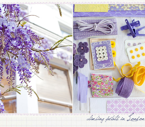
If you still didn’t hear about Leslie Shewring then you must be living on another Planet. Leslie is the famous color columnist on decor8 whose posts we breathlessly await every month, Leslie is an amazing artist and photographer, Leslie is the creative person behind this visual delight – A Creative Mint (which is a gem of a blog, by the way!). There is really no need to explain who is Leslie, right? She’s THE blogger we must know and look up to :). One thing I love about her blog is how well categorized are her posts, it’s so easy to browse when you have them organized by colors! Here are some of the too many pictures I wanted to share with you:
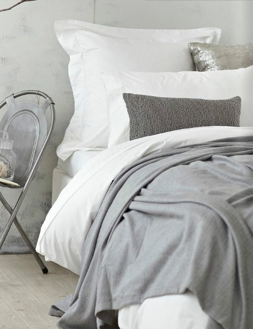
The power of gray
With the dreary days coming upon us I find myself caught in the timeless magic of the color gray which (especially these days) feels so adjustable and flexible. For an instance gray can be neutral and we can combine it with absolutely every single color (which will look like popping out, exactly because of gray), on another hand gray can be considered dramatic if used as a main (or the only one) color in a room and lastly, if combined with gold accents gray can look so elegant and timeless. If you think I’m wrong, please leave your thoughts in the comments :)
Rich emerald
Loving emerald, yet again! I can’t resist the temptation (nor I want to) to share with you some ’emerald’ finds of mine that I’m sure will inspire you. And by the way, I really think emerald is a stunning alternative to the traditional brown-golden-beige fall palette, along with teal (that I wrote about last week), but of course!
The two images below feel like the same room shot from different corners, no? The saturated emerald of the curtains are the perfect match for the armchair – to me this is one room! What do you think?
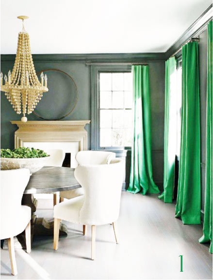
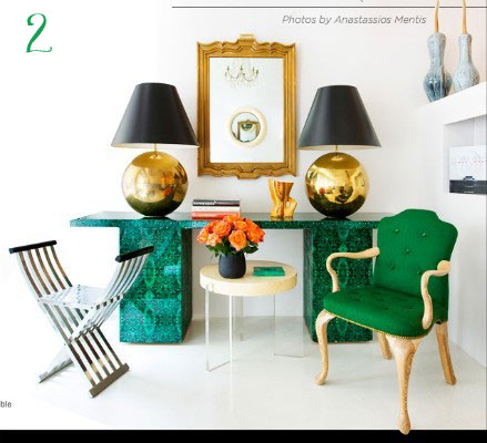
*image 1, 2
Pick a color for this fall? Check!
I’ve finally chosen a main color for this fall season! I never do that normally, but this year it just came onto me and I couldn’t help, but melt and accept the idea! You won’t be surprised to hear what is that color as I blogged a few times about it (like here, here and here) – teal/peacock blue! I’m fascinated with this rich and deep hue, it’s so sophisticated and glamorous! I love it both in interiors and fashion, so I guess my choice couldn’t be more perfect! I already bought a few scarves and pieces of jewellery and I won’t stop here – it’s been way too long since I had some popping colors in my life.
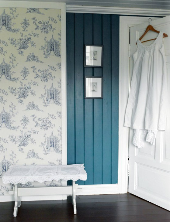
What is your color for this fall season? Are you sticking to the traditional brown or going with more daring shades?
*image via base
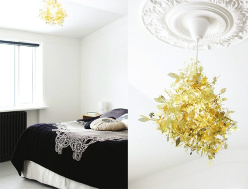
Color+Inspiration: Black, white and gold
Happy Monday to all! Today I have a special post for you, sort of. It’s about my favourite color combination at the moment: black, white and golden. These three shades are so elegant individually taken, so the effect they have when combined is like a bomb, a stylish one to be more precise. All in all, a bit of a glamorous and sophisticated trio, but nonetheless it provides us with a very cozy feeling, which is at the same time not too simplistic. Are you in for it?
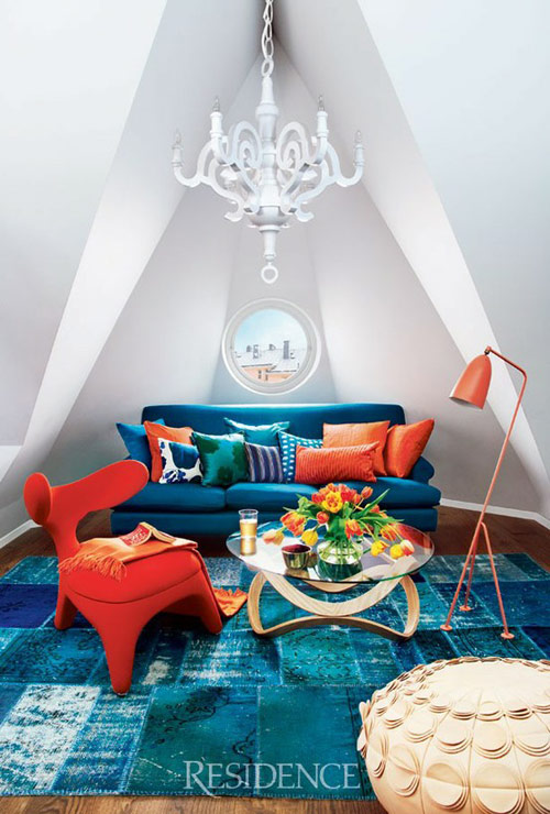
Teal fever
I’m loving teal as an alternative to green or blue or even these bright neon hues that are now everywhere – from furniture to wallpapers all the way to fashion! I kind of like how neon looks, however in hopes of being a trendsetter I now pronounce teal the new neon! And why not? Teal can look elegant, sophisticated (heck, yeah!) and not least very sexy! I think this color is slow, but steady becoming my go to shade (I really have this strong feeling that teal fever is yet to come in interior design world). Here I am, anticipating the trend with some inspiration:
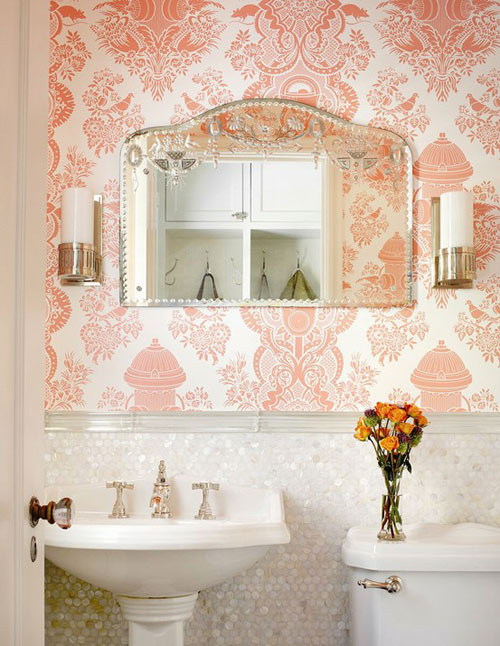
Soft salmon
To make sure we understood each other – it’s the color salmon I’m speaking of in this post. Don’t you just love the peach-y, coral-y and absolutely sexy nuance? To me it screams freshness, summer breeze and a very not-your-average feminine color. I’d love to know how do you feel about this color, as I’m pretty sure it will be around for some time, next to coral (that I’m dying for – you know that, right?). If you ask me what’s the new black, I know what I’m going to answer!
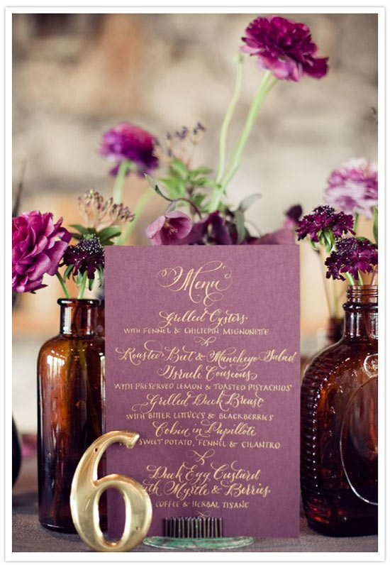
Love affair with: PLUM color
Not sure what has gotten onto me these days, but I’m having a serious crush on plum color. Perhaps it’s because of its elegance and deep sexiness, one thing is clear – with a white background, a pop of plum looks gorgeous and very royal! I’m liking the idea of a Scandinavian inspired room where it’s all so clean and minimalist with a statement piece in a deep plum shade – sounds delicious, right?
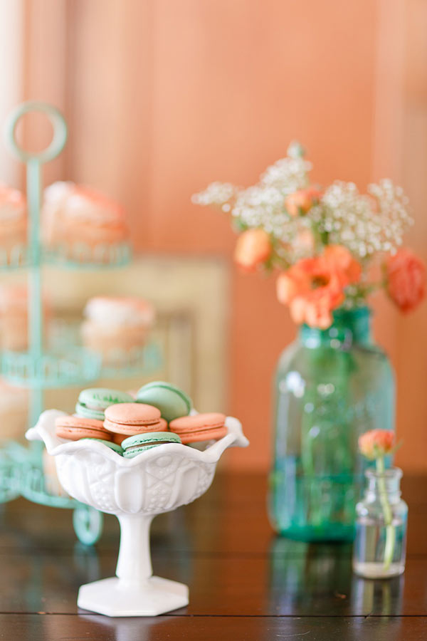
Color+inspiration: Peach and aqua
I fell head over knees for this color combination: peach and aqua! Seriously? My two favourite colors used together – this is a mix created in heaven and it means total perfection in my book! Besides aqua I also love how seafoam green looks with peach (or even orange), it’s such a refreshing and gentle duo! Here’s some inspiration, what do you think about the look of these two shades together?
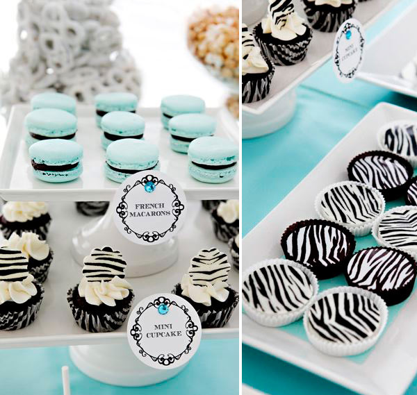
Dessert table: Tiffany blue+zebra
I know I normally don’t post party ideas and entertaining tips, but that doesn’t mean this isn’t inspiring me or has me swooning. So now, to show how wide my interests are I decided to share with you a dessert table created around a stunning colour – Tiffany blue (my color inspiration post you can see here) and a fabulous, bold pattern – zebra! Can you imagine the combo? Gentle and daring, airy and sophisticated – the uncombinable turned out to be a gorgeous colour theme, perfect for a baby shower, bridal shower or just a birthday party!

