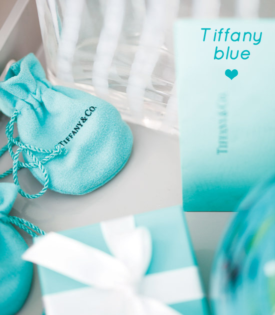
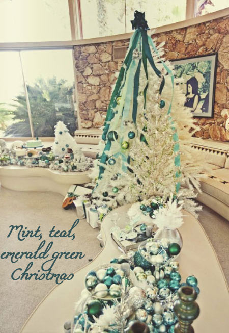
Good Monday morning! Hoping that you all had a fabulous weekend, will kick off this week with a color+inspiration post and just so you know for the past few days I was inspired to no end by a very bright and lively shade of blue: Tiffany blue, the color of the famous Tiffany & Co. Probably I don’t need to explain much why do I love both the color and the company, I just do and am pretty sure I’m not alone. Here’s some Tiffany blue inspiration:
Color+Inspiration: Pastels
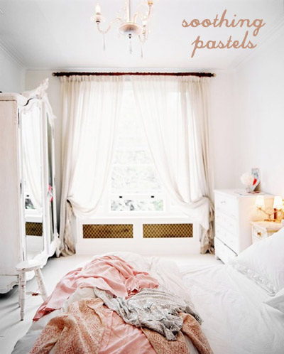
Running my street style photo blog for a few months now allowed me see some tendencies, color choices which are often used and some trends. And yes, we’re speaking about fashion when mentioning my site, but I figured that the same (or at least similar) principles apply to interior design, no? If to recall photography that caught my attention, made me gasp, left me uber inspired – yes, we’re speaking about pastel colors brought indoors, emanating soothing vibes, relaxing and tempting us. Here are some pictures for a color+inspiration post:
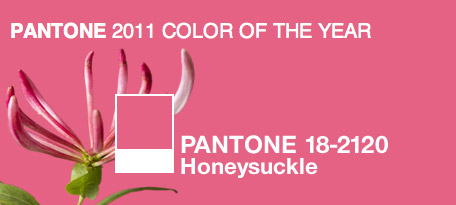
Honeysuckle – color of 2011
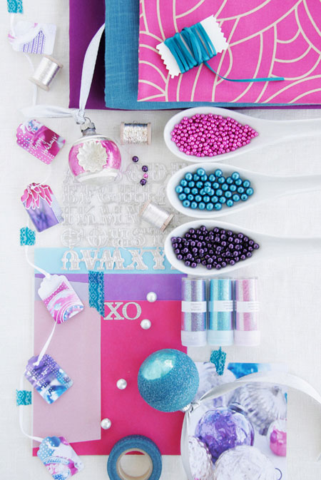
No surprise that recently Pantone named the color of the new year and this is Honeysuckle! This is a reddish-pink shade, something in between fuchsia and pink. I love everything pink, from soft pale to hot pink to fuchsia – I’ll take it all (if you have doubts, check this post and this, this, this, this and this :D). Here’s what honeysuckle looks like:
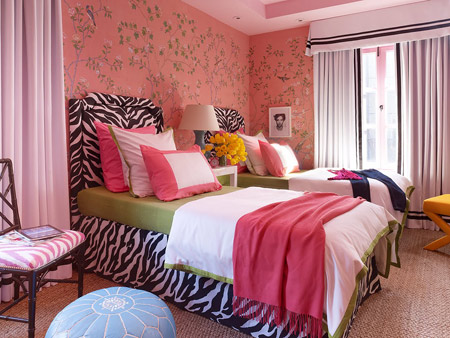
Long before Pantone called Honeysuckle the color of 2011, designers were feeling the trend without even knowing about the great importance this pink will have the forthcoming year. One of those designers is Grant K. Gibson. The teenage-girl bedroom he designed a few months back for Elle Decor showroom is in this gorgeous color (honeysuckle, that is). Little did he know he’ll be a trend setter. The wallcovering is to die for and all the pink details are sure to make you drool! And me too. Here is the famous and all the way stunning bedroom:
Color+Inspiration: Cobalt blue+Orange+Gold
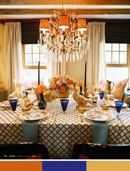
And Eddie Ross did it again! With Jaithan Kochar of course. Their Thanksgiving table setting in the latest Lonny is gorgeous and I literally gasped when that stunner was in my eyes. Decorated with cobalt blue, gold and orange the table was perfect: glamorous yet cozy, modern yet rustic. Oh Eddie, what have you done? The Thanksgiving table will always stay in my heart as the image of a magic holiday, inspiring me to take out my most precious china, use my embroidered tablecloth and add hints of gold to ANY table setting, not only festive ones! I know this post could go as Thanksgiving inspiration, but I thought emphasizing the amazing color combination is just a must for a color enthusiast like me :). Cobalt blue, gold and orange is equal to bliss in my book (thanks to Eddie for this, before I never thought about these three colors together)!
Color+Inspiration: Chartreuse+Fuchsia
Hello, sweets! How are you? I’m dying to know what’s happening in your side of the world, things are busy with me and am feeling a bit overwhelmed with everything what’s happening in my life at the moment (all good!), but tell me more about you! I wanted to take the time and thank you all who voted for me in the October challenge on Design Refuge, I can feel all your support and this is making me so proud and honored to have such fabulous readers, thank you so much for everything!
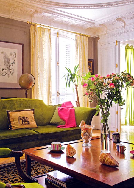
Back to my post, last week, I’ve been scanning some old magazines I had and was amazed by how inspiring at the moment can be pages which you flipped through months ago! Seriously, I felt like I’m looking at the images with different eyes and it was so great to get fresh ideas from an old issue of a design mag! Case in point, I saw a picture where there was a living room decorated with chartreuse and fuchsia (screaming colors!) and touches of brown and white. I mean hello! I blogged about chartreuse and fuchsia, but in different posts and now I saw them together and it’s quite a stunning combo, if I say so myself!
Project Pink & Happy weekend
I guess I can say this working week has finished, time for weekend and lots of fun! I wanted to leave you with some pretty pictures so you can enjoy, however I thought why not have some use of this, right? As you all know, October is considered the month of breast cancer awareness in USA and the fact that I’m not from USA didn’t stop me from supporting this cause as it’s a very weak spot for me. My grandmother passed away many years ago because of breast cancer, so in her honor I decided to put together a post about pink – color of the famous ribbons. Why project pink (see the title)? Because for every tweet on Twitter which has the hashtag #projectpink is donated $1 to this cause, so go ahead, tweet about it!
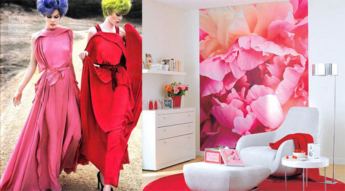
Meanwhile, here are some pictures where fashion meets decor, all about pink:
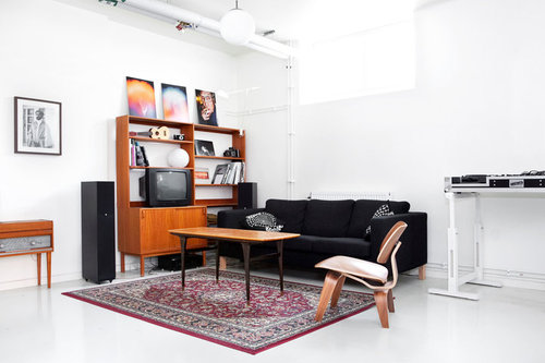
Color+Inspiration: White, Black & Camel
Hello, my friends! We’re on half way to weekend, so get excited, we’re almost there! Yesterday while flipping through my brand new and first issue of Norwegian Elle Interior I came across a picture which had me enlightened. How didn’t I think before about black, white and camel color combination? I mean in my book these three colors are the image of modern, stylish yet warm and cozy interiors! Just feels this way! A timeless inspiring look of a black and white space is undoubtedly the chicest thing ever, but when these two are accompanied by a natural, indeed a warm shade (and don’t get me started on how trendy camel is this season, both in fashion and interior design!) you know that you did GOOD!
Color+Inspiration: Black+Orange
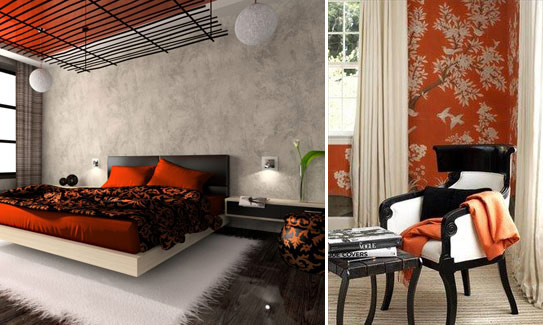
Another successful title for this post would have been Halloween color inspiration. Tell me something, doesn’t the thought about black and orange lead you to Halloween? It sure does to me! That’s what happened earlier today, when I was checking some Halloween inspired pictures, the idea struck my mind instantly! However, I must admit that the combo itself looks pretty elegant and timeless, orange making it look very rich, while black is giving modern chicness. And I thought that touches of white won’t hurt, making for a crispy, less spooky look :). Yet again, when I see orange paired with black I can’t avoid thinking about Halloween, does it happen to you the same? Here are some pictures inspired by this color combo:

