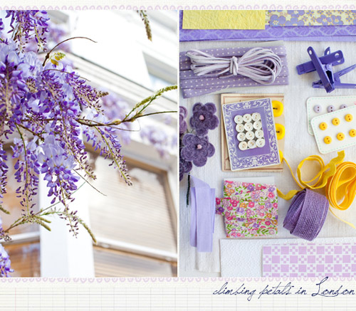
If you still didn’t hear about Leslie Shewring then you must be living on another Planet. Leslie is the famous color columnist on decor8 whose posts we breathlessly await every month, Leslie is an amazing artist and photographer, Leslie is the creative person behind this visual delight – A Creative Mint (which is a gem of a blog, by the way!). There is really no need to explain who is Leslie, right? She’s THE blogger we must know and look up to :). One thing I love about her blog is how well categorized are her posts, it’s so easy to browse when you have them organized by colors! Here are some of the too many pictures I wanted to share with you:
Chartreuse obsession
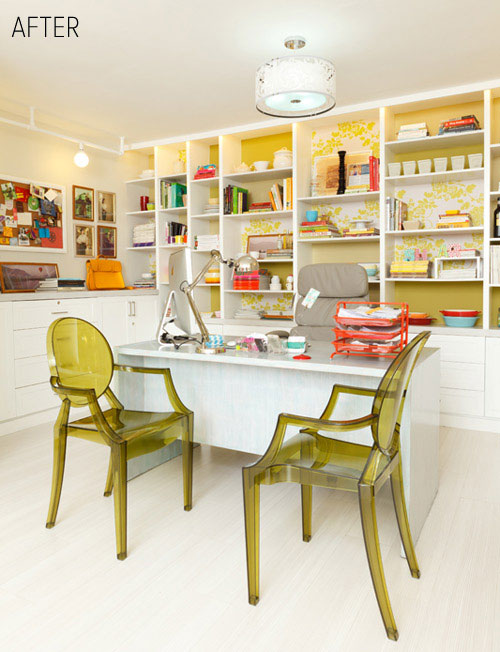
I don’t often see chartreuse used in home decor and although I blogged about it awhile back (here and here) I still find it quite intriguing and modern. Like for example, who’d think chartreuse might look so amazing in a home office? I’m stunned by the richness of this shade against white walls and how well it might complement other bold colors like fuchsia, yellow etc.
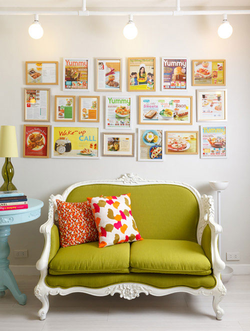
P.S. How fun it is to frame magazine covers and hang them on the wall? Have always thought the idea is brilliant!
P.P.S. Louis ghost chairs in that olive green color? I DIE.
*images via design sponge
Teal fever
I’m loving teal as an alternative to green or blue or even these bright neon hues that are now everywhere – from furniture to wallpapers all the way to fashion! I kind of like how neon looks, however in hopes of being a trendsetter I now pronounce teal the new neon! And why not? Teal can look elegant, sophisticated (heck, yeah!) and not least very sexy! I think this color is slow, but steady becoming my go to shade (I really have this strong feeling that teal fever is yet to come in interior design world). Here I am, anticipating the trend with some inspiration:
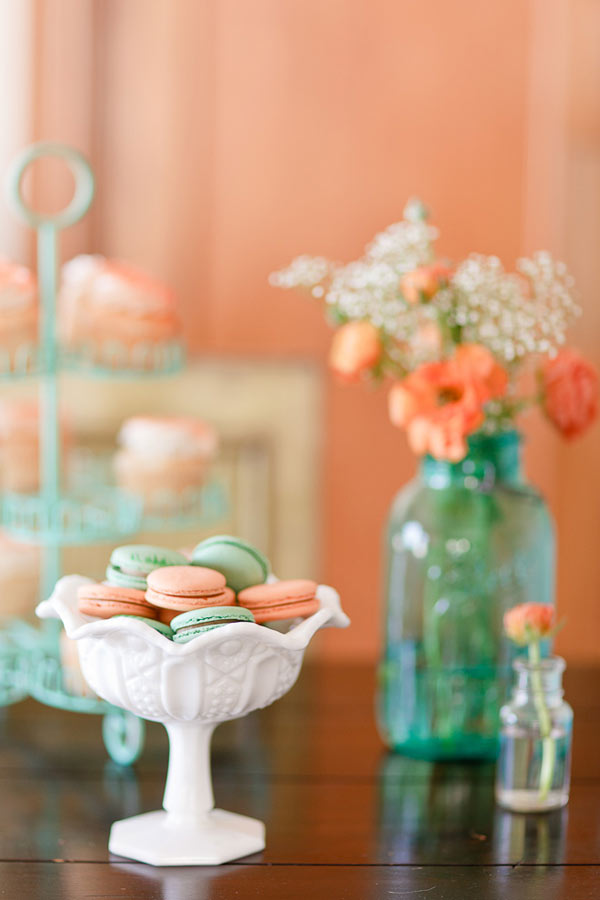
Color+inspiration: Peach and aqua
I fell head over knees for this color combination: peach and aqua! Seriously? My two favourite colors used together – this is a mix created in heaven and it means total perfection in my book! Besides aqua I also love how seafoam green looks with peach (or even orange), it’s such a refreshing and gentle duo! Here’s some inspiration, what do you think about the look of these two shades together?
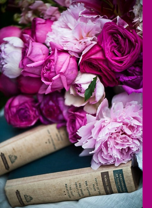
Color+Inspiration: Magenta
Ok, this must be a color+inspiration week. Not sure what has gotten onto me, but today I’m blown away by another color – magenta! I know some people call it fuchsia, others even pink, but I’m all for calling it this sophisticated name (it’s also cool and stylish, right?). Here’s my color+inspiration post for this sunny and hot Friday! Enjoy!
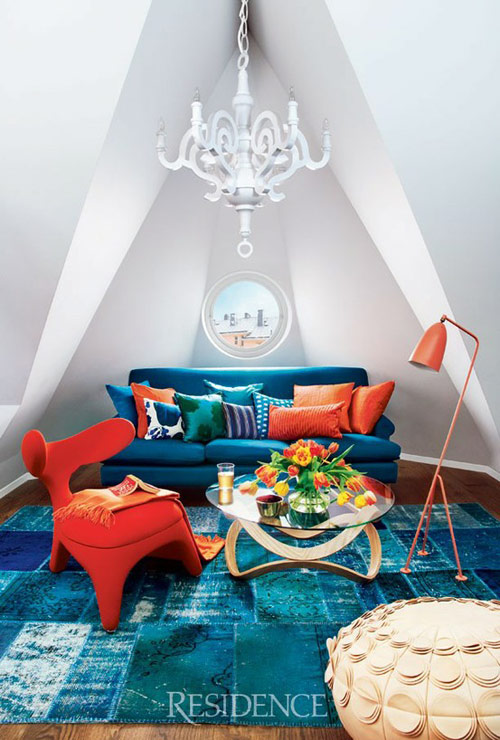
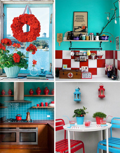
Color+Inspiration: Aqua+Red
What’s with this combo, I get to see plenty of it and it’s literally everywhere – in the kitchen, in the patio, in the living room and at parties! Well, I can totally understand the trend, bright and fresh aqua looks fabulous with hot, daring red – it’s like something you’d never put together yet which looks fantastic when combined. You know what I mean, right?
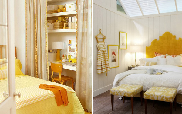
Mellow Yellow
I hope I didn’t whine too much about how much I want sun and warm weather, did I? Good, then one more post will not hurt either. Seriously I cannot wait anymore! A post dedicated to a shade of yellow which is fuzzy, soft, dreamy and truly feels like sun – it’s a mellow yellow inspired post! Not too smart, not too boring, just the perfect dose of pretty pictures that I’m sure you’ll all love (haven’t met ONE person in my life who doesn’t like yellow, have you?).
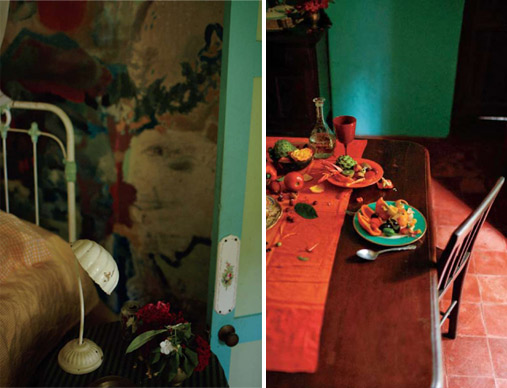
Color+Inspiration: March hues
Today I have a different kind of post. Better saying, a different kind of Spring hues. Remember when a few days ago I was all about yellows, aquas and oranges? Well, Anthropologie catalogue took me to a whole new level of Spring hues. Today I’m at emerald green, stunning teal, rich tangerine, rusted browns which scream sophisticated elegance and deep mystery.
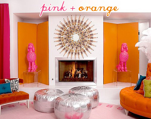
Color+Inspiration: Pink+Orange
Perhaps it’s the anticipation of spring or Valentine’s day which happens to be today (see my post dedicated to it here), but I’m really attracted by bold, bright and so passionate hues such as orange and pink, particularly about this combo. The vibrant color combination shouts modern and daring and while I thik it might be too much for a living room, it certainly looks amazing in a girl’s room, kitchen or seen in smaller details such as rugs, bedding, curtains so on. Oh not to mention that pink+orange left its marks in fashion too! Various designers have their spring/summer collections around this combo and it totally looks chic!
Color+Inspiration: Tiffany blue
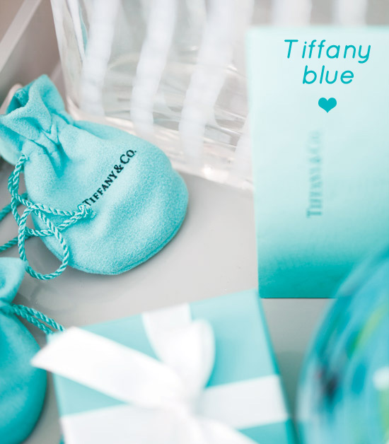
Good Monday morning! Hoping that you all had a fabulous weekend, will kick off this week with a color+inspiration post and just so you know for the past few days I was inspired to no end by a very bright and lively shade of blue: Tiffany blue, the color of the famous Tiffany & Co. Probably I don’t need to explain much why do I love both the color and the company, I just do and am pretty sure I’m not alone. Here’s some Tiffany blue inspiration:

