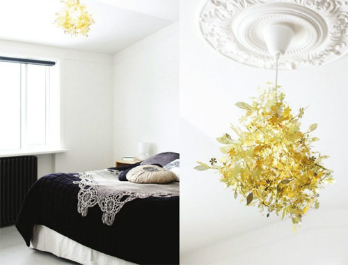
Happy Monday to all! Today I have a special post for you, sort of. It’s about my favourite color combination at the moment: black, white and golden. These three shades are so elegant individually taken, so the effect they have when combined is like a bomb, a stylish one to be more precise. All in all, a bit of a glamorous and sophisticated trio, but nonetheless it provides us with a very cozy feeling, which is at the same time not too simplistic. Are you in for it?
Bohemian dream
Ok, this settee/bed is simply dreamy! So bohemian, so gorgeous – not that I would say effortlessly, but nonetheless this looks like a perfect place to put your feet up (figuratively, after all you don’t really have where to put them up, hee hee). I’m definitely dreaming about a bed like this – I can’t even imagine how heavenly relaxing it feels like to cuddle with a book.
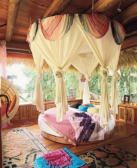
*image via Boho glamour
Est Magazine
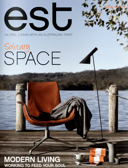
Hi all! I know I said a few days ago that I’m back, assuming I’ll start posting regularly, but you know how post-vacation time is, right? I also needed some time to adjust and get back on track, so well it took me a while :). I’m now here though, ready to introduce you to an amazing magazine that you simply can’t miss (nor you wouldn’t want to). I’m speaking about EST Magazine, a gem of a virtual publication that has everything the design lover inside of you might like: from fabulous palettes of colours to peaks inside real homes to food and travels – they have it all covered and it looks absolutely stunning. Here’s what I highlighted, but do check the rest!
Teal fever
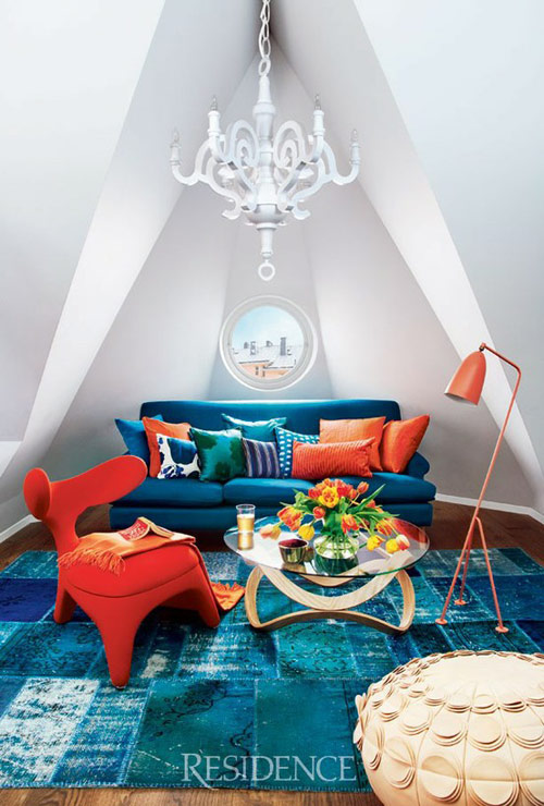
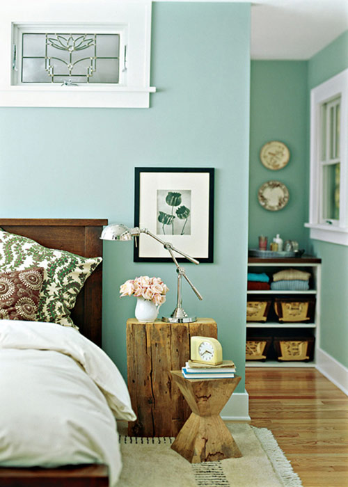
I’m loving teal as an alternative to green or blue or even these bright neon hues that are now everywhere – from furniture to wallpapers all the way to fashion! I kind of like how neon looks, however in hopes of being a trendsetter I now pronounce teal the new neon! And why not? Teal can look elegant, sophisticated (heck, yeah!) and not least very sexy! I think this color is slow, but steady becoming my go to shade (I really have this strong feeling that teal fever is yet to come in interior design world). Here I am, anticipating the trend with some inspiration:
Bulbs instead of chandeliers? Heck, yeah!
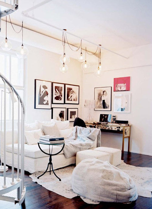
I’m liking the idea of having hanging bulbs as light fixtures, you know? As much as I love chandeliers (proof here) I sort of think it’s time to bring something new and modern into this. Plus, for some reason the huge bulbs are SO Scandinavian in my opinion and I couldn’t love it more, the look of an oversized bare bulb hanging over a dining table (add some vintage chairs while we’re at it) and you get a picture perfect dining area! Well, bulbs look equally good elsewhere, here’s some inspiration:
Home tour: Caribbean dream
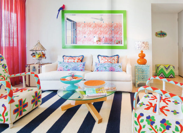
This home makes me happy! You know the feeling when you come across a home that is feast for your eyes and just the thought of living in puts on a big smile on your face? Well, I have this feeling quite often and just when I thought it can’t get better – I stumble upon Adore home magazine‘s new issue! And in there is this home called “Caribbean dream” which is just as colourful as you might imagine, with patterns galore – a true tropical fiesta! Here’s a glimpse at it:
Wood and baby blue
So we’re back again – hello, Monday! As much as I wish the weekend would last longer, I’m well aware this won’t happen (not this week, at least – might happen next week as I’m having my vacation!). To kick off this week I decided write about something that will brighten my days a bit (with all the rain we’ve had for the past 10 days), so some breezy baby blue will do the trick. Even more when this color is perfectly (and unexpectedly) stylized with wood and some pretty vintage details. And what can be better than vintage, right?
Soft salmon
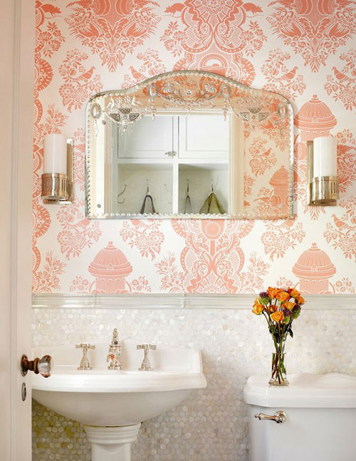
To make sure we understood each other – it’s the color salmon I’m speaking of in this post. Don’t you just love the peach-y, coral-y and absolutely sexy nuance? To me it screams freshness, summer breeze and a very not-your-average feminine color. I’d love to know how do you feel about this color, as I’m pretty sure it will be around for some time, next to coral (that I’m dying for – you know that, right?). If you ask me what’s the new black, I know what I’m going to answer!
Love affair with: PLUM color
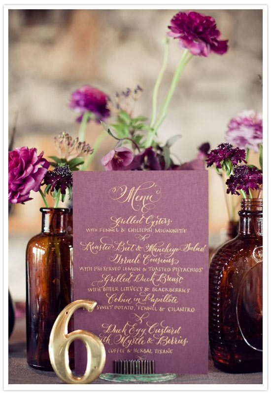
Not sure what has gotten onto me these days, but I’m having a serious crush on plum color. Perhaps it’s because of its elegance and deep sexiness, one thing is clear – with a white background, a pop of plum looks gorgeous and very royal! I’m liking the idea of a Scandinavian inspired room where it’s all so clean and minimalist with a statement piece in a deep plum shade – sounds delicious, right?

