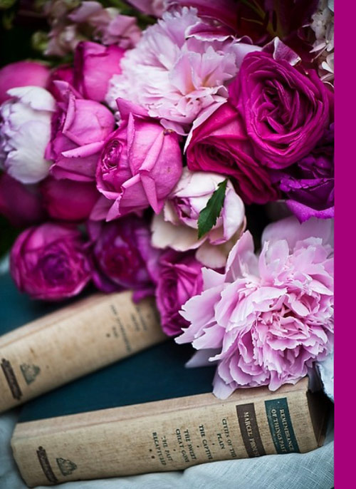
And here I am again asking myself what do Swedish and Danish people have that we all don’t? Is it something about the air or we’re simply meant to be different? You’re probably wondering why am I asking this, right? Well, have you seen better homes than those in Sweden and Denmark? Whether we’re speaking about interior designers or just people who like to decorate, they’re equally talented and the outcome (i.e. homes) is just stunning! I’ve been featuring lots of Scandinavian home tours here on the blog, so here is one more, a summer house to die for!
Symmetry
There is something so neat about symmetry in interior design. Clean look, balance when it comes to details – this just screams modern and look-but-don’t-touch kind of feeling. While I do love a bit crazier and artsy style for a room, sometimes symmetry feels just right, it’s like helping to keep everything under control in life, you know what I mean? Hoping you did understand me, here’s a picture that just stood out to me exactly because of the proportionality in art, colors, details.
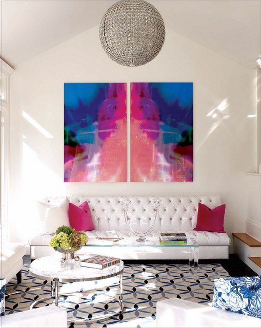
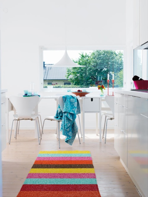
Another thing I love about this living room is the rug, I find the pattern one of the prettiest and those colours complement it just perfectly!
What about you? Are you a fan of symmetry or not really?
*image source
Chevron tray DIY
I fell SO in love with this tray, the colour, the pattern – it all made me happy! I mean who wouldn’t fall for orange chevron, right? And the best of it is that you can DIY it and Martha Stewart is right here to help. Read here the directions to re-create this gorgeousness.
Happy Monday!
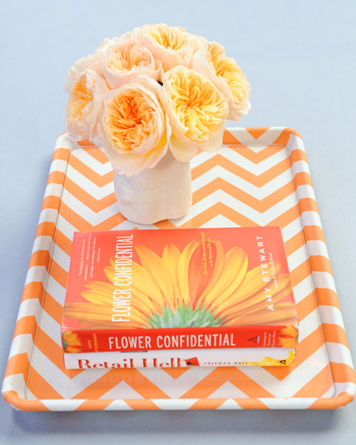
*image via Martha Stewart
Weekend inspiration
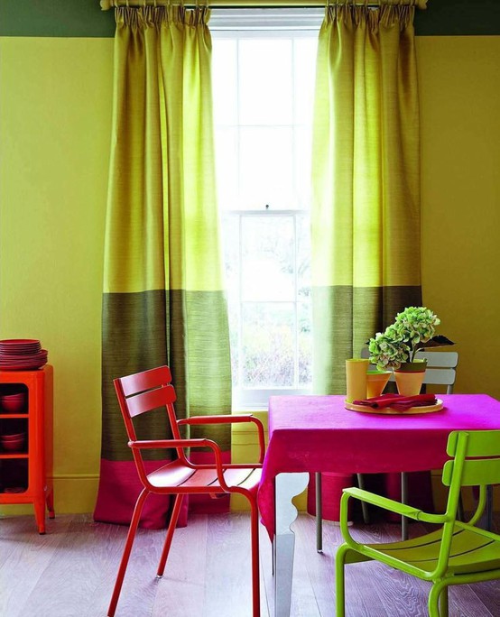
Happy weekend, darlings! This weekend I’m going to be inspired by bold hues and this picture is pretty much what I’m talking about: hot fuchsia, olive (and a hit of apple) green and red – looks to me like a very lovely combo, no?
Happy 4th of July to all my friends who celebrate (still remembering last year’s color inspiration post dedicated to this holiday – oldie, but goodie!). See you next week! xo
*image via the city sage
That unforgettable blue motif…
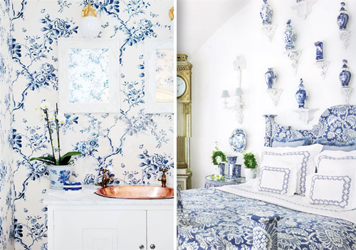
Happy Monday, dears! I’d like to start off the week with a pattern that has me swooning every time and that is the blue motif – delft blue. These days we can not only see it in porcelain items, but also in fashion industry, jewellery, wallpapers and much more. I found some examples that make my eyes happy! Have a smasing week!
Not your average dresser
I saw this patterned dresser in a magazine and boy, I had to share it with you! Its oriental look was hard to be ignored and its timeless colour palette was too elegant to be passed away. All in all, not your average (boring, plain coloured – you name it) dresser. Such a sophisticated piece would a fabulous addition to a modern, fancy space bringing a fresh twist into the room.
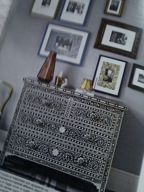
*picture taken with my phone, via casaviva Italy
Dining extravaganza
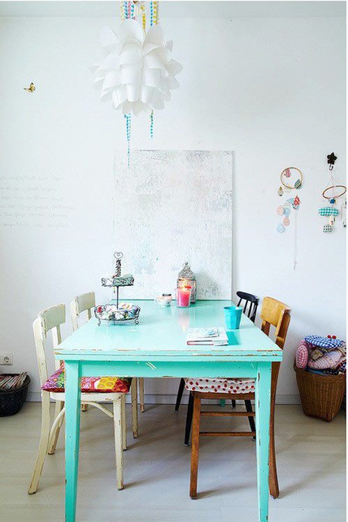
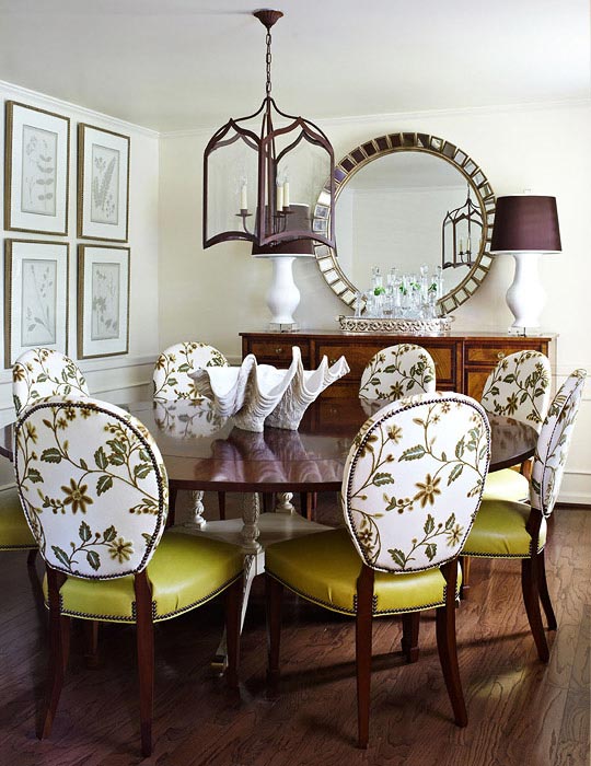
I’ve always thought how do many mismatched chairs look in one dining room and when I say mismatched I don’t mean just colour, I mean everything from shape to era & style and all the way to texture – did you ever think about it? Well, turns out they do look stunning, injecting a dose of chic extravaganza and not your average ordinary (matchy) dine place – they infuse character and personality into a space, making it different than all the others rooms in a home. I’m especially smitten by the look of a vintage-y dining space, with a washed off white dining table and with some chairs that just pop up (imagine this bliss?). Actually the below pictures are exactly what I envisioned now.
Coral & pattern
I love coral, I find it a very hot and absolutely gorgeous, summery colour! And while browsing for some refreshing pictures yesterday I came across one room I just couldn’t pass on. The juicy coral/orange shade throughout the living room has instantly taken me to a modern beach cottage, with the smell of the sea coming through the window and with a huge stack of magazines (I’m a nerd, I know). Oh, and the pattern seen in drapes, wallpaper, lamp shade, arm chair & ottoman upholstery is so delicious – it was a perfect fit! Happy Monday!
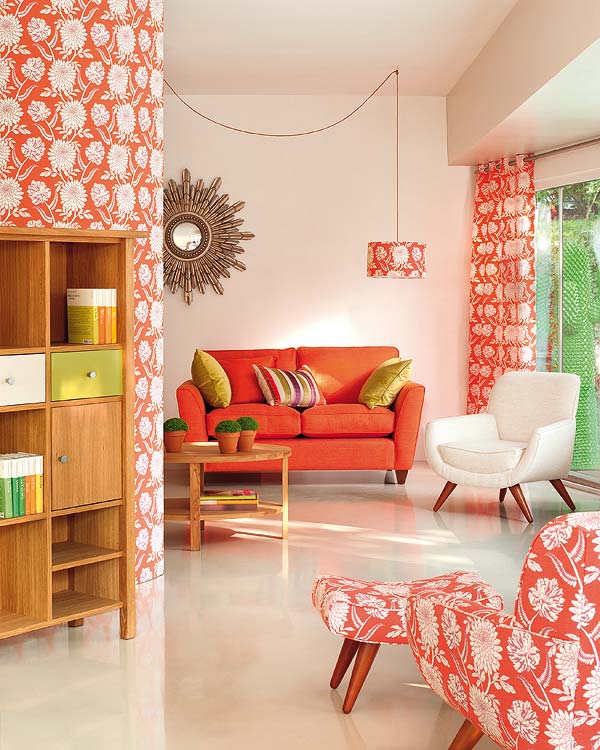
*image via mi casa
Home tour: Tobi Fairley
I’ve been a fan of Tobi Fairley since forever and I truly believe she’s a genius! Her design aesthetics is incredibly chic and modern, all the rooms Tobi created are to die for – Tobi rocks it big time. Also, I believe she’s the kindest and most adorable person ever, really! Imagine my feelings when I saw her home! Oh my, you guys – it’s amazingly gorgeous and inviting! Here, I’m sharing it with you! Bravo for Tobi!
Color+Inspiration: Magenta
Ok, this must be a color+inspiration week. Not sure what has gotten onto me, but today I’m blown away by another color – magenta! I know some people call it fuchsia, others even pink, but I’m all for calling it this sophisticated name (it’s also cool and stylish, right?). Here’s my color+inspiration post for this sunny and hot Friday! Enjoy!

