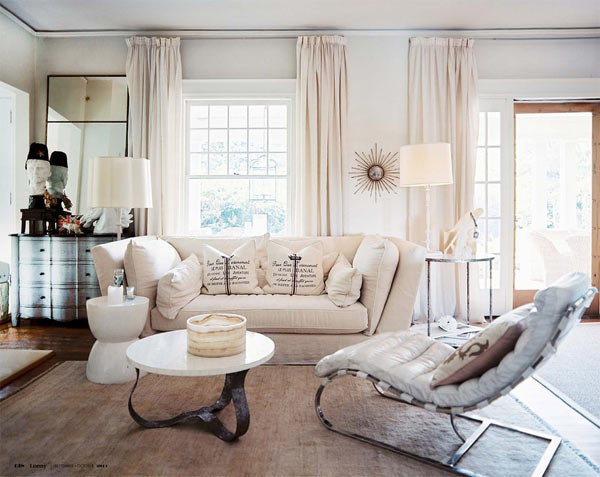
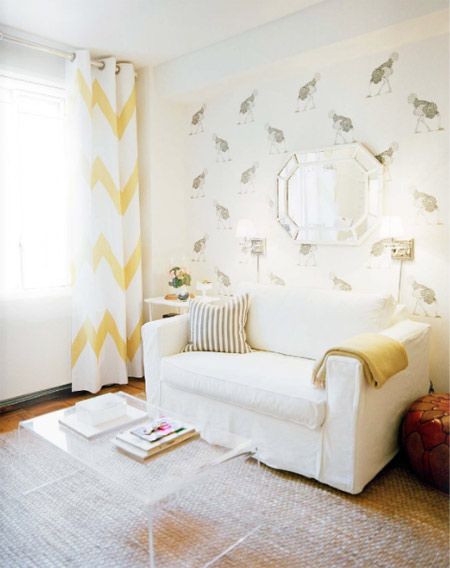
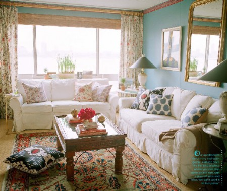
Perhaps I’m anticipating the cool days that fall (and winter afterwards) has to offer to us, but I found myself today craving cozy, warm homes. And just perfect felt (I swear, I really had my heart skipping a beat at the idea of) an image of a soft beige room, without any bold hues or details, just the grandeur of a soothing space where it’s all about earthy, warm colors. These shots from the latest Lonny speak for themselves:
Office spaces to inspire
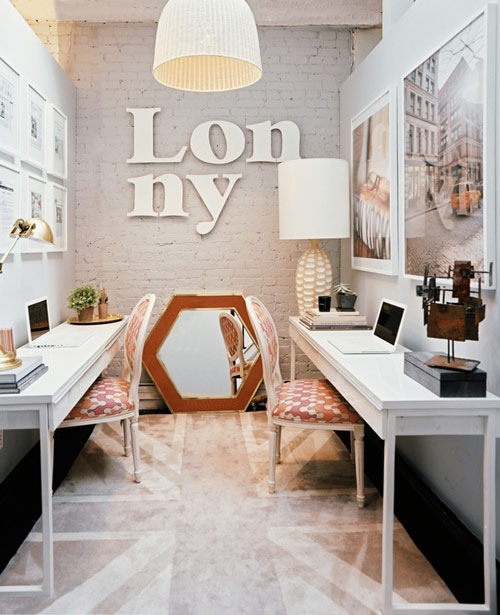
We all know that for a productive day we need an office which is both cozy and motivating. And yes, I truly believe an office is like a bed – crucial for one’s life, I mean how cranky can you be when your bed sucks, right? So since I don’t really have a comfy-inspiring office, I decided to browse around the web and indulge myself with pretty pictures – hopefully that will make me do something to improve my own situation. Ok, enough chit-chat, here are some office spaces that have me drooling big time.
Porcelain dog
I’m very much in love with them lately. You saw porcelain dog statues before and so did I, but just now I felt the urge to own one and it’s all because of their sophisticated and royal-like look! An image in the latest Lonny Magazine (which is absolutely fantastic, by the way!) shows exactly what I mean.
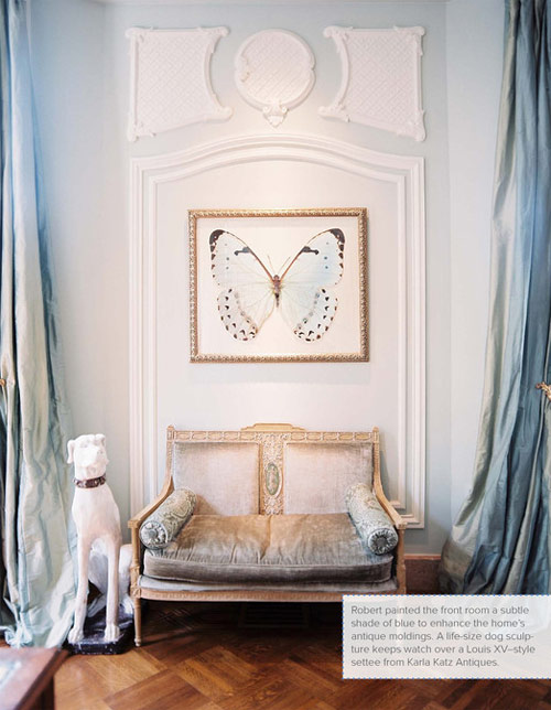
Not that the rest of the picture doesn’t deserve applause, however the dog is an absolute favourite piece making the room feel even more elegant and chic, right?
*image via Lonny
Tradhome magazine
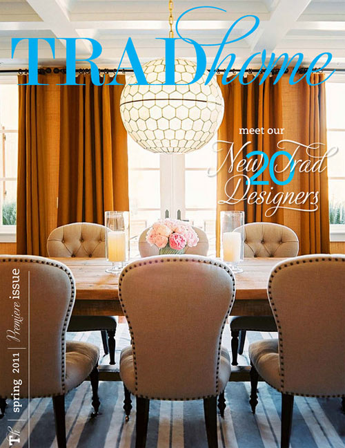
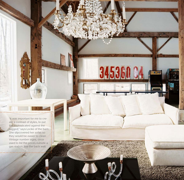
By this moment you have all probably heard about the collaboration between Lonny magazine and Traditional home. Have you checked Tradhome mag yet? Just as its title says, the magazine is full of traditional designs and while I never thought I like traditional designs, I found the interiors from Tradhome very refreshing and innovative. However one thing I’ve learned throughout the magazine is that traditionalism can look stunning, but only when you add your own, special touch to the room: this might be an eclectic or extravagant piece – important is to break a little the ‘too traditional’ look of the space. The traditional tendencies seen in the magazine were the use of gold, black, white, brown and neutral shades and I guess that’s exactly what felt like a breath of fresh air to me.
Latest Lonny
I know I’m way too late to the party, but how could I skip posting about the latest Lonny mag? I couldn’t, so here I am with a few of my favorite pictures. I must say, I was at the point when I thought Lonny just CAN’T get better and voila, the March/April issue is more gorgeous than any other! If you had time to flip through the mag, what did you like the most? Because I really can’t choose!
Home Tour: Michelle Adams from Lonny magazine
Good morning, my friends! How was your weekend? Oh and yes, happy Monday! A new week ahead and what can we call a best start other than a home tour featured in the new issue of Lonny Magazine? Amazing people to be seen there, fabulous interiors and actually I don’t think I should say more, you know it anyways. So as I said, home tour and today we’ll visit the home of the editor in chief of Lonny Mag Michelle Adams, how exciting is this? Using all her creativity and lots of inspirational New York interiors (hello! she’s the editor of a design magazine), Michelle is now living in an eco-friendly, sophisticated, but comfy space. Please join me for the home tour:
There is never too much Light…
Daylight, sunlight or something related to light. I’m loving interiors with big windows and white-creamy-pearl colors. Alright, the list of my favorite light colors it’s longer, so I just mentioned the short version. And the trick I’ve learned is that if you want an apartment that looks so much light, use the colors from the light white spectrum and you won’t fail! Plus, I know that if you have a small apartment, you will make it look way bigger only if you paint your walls in white :). Easy, isn’t it? Here are some images of a really light space, designed by Sara Gilbane, a very talented interior designer. Enjoy!

